![[SnapEvent]Android 5.0 的Toolbar+Tab+ViewPager](http://mis101bird.github.io/images/snapevent2.png)
目標
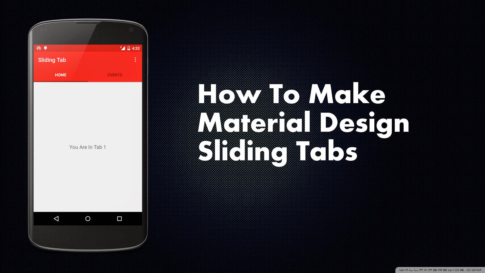
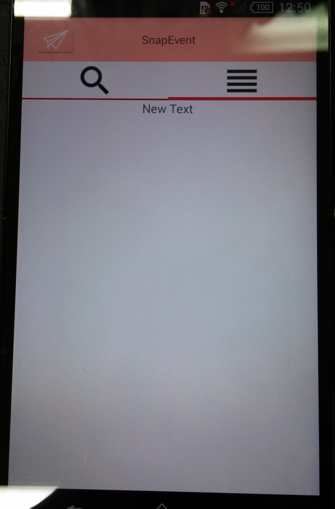
本篇目標將解說如何用Android 5.0的Toolbar+Tab+ViewPager實作出以下效果。想看如何直接使用Github上神人開發的MaterialTabs套件,請拉至最下面。
Android 的Bar和Tab之發展歷程
自從Android 3.0 (API 11)出現ActionBar後,此原件被使用了很長一段時間,直到現在Android 5.0 的Material Design UI大變革,出現了取而代之的ToolBar!Tab撰寫方式五花八門,從使用Android 3.0後的Fragment實現Tab功能到Google釋出的開原專案-Sliding Tab(用ViewPager實作),製作滑動式標籤的開發者以此專案為基礎再客制化,更有人直接寫成套件讓大家開發更為便利! 之後Tab發展彷彿告一個段落,直到Android 5.0 降臨!好用的TabLayout結合Ripple套件的水波紋效果,讓App體驗更有質感,開發也變得更簡單了!
使用新技術時,最該注意的就是版本的向下支援!幸好Android 5.0的Material Design 有v7 appcompat library包和Theme.AppCompat主題能向下支援到API 7 (Android 2.X),包含到98%的使用者! 之前ActionBar 沒有支援Android 3.0 (API level 11) 以下的相容包,導致開源神人們自行開發出非官方的ActionBarSherlock向下支援到 Android 2.x ,讓開發者廣泛使用,直到官方相容包ActionBarCompat出世。 套件換來換去,真是苦了當時的Android開發者,各種不同版本的實作方法充斥網路也增加了Android初學者學習的困難度。所以如果向下相容包還未釋出,最好別太快使用新版本開發。
Android Support Library的包名,例如v4 Support Library、v7 gridlayout library、v7 appcompat library等,前面的v?代表向下支援到Android API Level ? 。
1 ) 引用程式包,使它能向下相容
dependencies {
    compile fileTree(dir: 'libs', include: ['*.jar'])
    compile 'com.android.support:appcompat-v7:22.2.1'
    compile 'com.android.support:design:22.2.1'
}
2 ) 建立ToolBar+Tab的xml布局
以前撰寫ActionBar要繼承ActionBarActivity再用getSupportActionBar()來取得控件,再進行進一步客製化。這種不直觀的撰寫方式,到ToolBar獲得改善。 有了ToolBar+TabLayout,讓上方導覽列也進入xml布局的行列,讓設計更有彈性。 建議將上方導覽列佈局分出成一個xml檔,在個別Activity佈局裡用include標籤匯入,才不會每次都Copy重複的程式碼,也增加程式的效率。
top_section.xml
<?xml version="1.0" encoding="utf-8"?>
<android.support.design.widget.CoordinatorLayout xmlns:android="http://schemas.android.com/apk/res/android"
    xmlns:app="http://schemas.android.com/apk/res-auto"
    android:id="@+id/main_content"
    android:layout_width="match_parent"
    android:layout_height="match_parent"> #CoordinatorLayout為Android Design Support Library包的組件,為增強型FrameLayout

    <android.support.design.widget.AppBarLayout
        android:id="@+id/appbar"
        android:layout_width="match_parent"
        android:layout_height="wrap_content"
        android:theme="@style/ThemeOverlay.AppCompat.Dark.ActionBar"> #作為Toolbar組件和TabLayout組件的Layout父容器,能設定Toolbar和TabLayout的共同屬性

        <android.support.v7.widget.Toolbar
            android:id="@+id/toolbar"
            android:layout_width="match_parent"
            android:layout_height="?attr/actionBarSize"
            android:background="?attr/colorPrimary"
            app:popupTheme="@style/ThemeOverlay.AppCompat.Light"
            app:layout_scrollFlags="scroll|enterAlways"> #Toolbar我使用官方ThemeOverlay.AppCompat.Light style,只調整background顏色

            <TextView
                android:layout_width="wrap_content"
                android:layout_height="wrap_content"
                android:text="SnapEvent"
                android:layout_gravity="center"
                android:id="@+id/toolbar_title"
                android:textSize="16dp"
                android:textColor="#ffffff" /> #添加Text在Toolbar中間

            </android.support.v7.widget.Toolbar>

        <android.support.design.widget.TabLayout
            android:id="@+id/tabs"
            android:layout_width="match_parent"
            android:layout_height="wrap_content"
            style="@style/MyCustomTabLayout"
            android:background="@color/window_background"/> #Tab使用自定義MyCustomTabLayout style

    </android.support.design.widget.AppBarLayout>

</android.support.design.widget.CoordinatorLayout>
把上方導覽列匯入到main_activity.xml並在下方加上ViewPager控件,等待之後和TabLayout連結。
<?xml version="1.0" encoding="utf-8"?>

<LinearLayout xmlns:android="http://schemas.android.com/apk/res/android"
    xmlns:app="http://schemas.android.com/apk/res-auto"
    android:orientation="vertical"
    android:layout_width="match_parent"
    android:layout_height="wrap_content">

    <include layout="@layout/top_section"
     /> #include top_section.xml進來

    <android.support.v4.view.ViewPager
        android:id="@+id/viewpager"
        android:layout_width="match_parent"
        android:layout_height="match_parent" />

</LinearLayout>如果要在ToolBar中新增menu表單,請參照此篇教學,作法和ActionBar相差不大。
3 ) 建立客製化的MyCustomTabLayout style
style.xml
<resources>
    <style name="MyCustomTabLayout" parent="Widget.Design.TabLayout">
        <item name="tabMaxWidth">@dimen/tab_max_width</item>
        <item name="tabIndicatorColor">#FA5858</item>
        <item name="tabIndicatorHeight">2dp</item>
        <item name="tabPaddingStart">12dp</item>
        <item name="tabPaddingEnd">12dp</item>
        <item name="tabBackground">?attr/selectableItemBackground</item>
        <item name="background">@android:color/white</item>
        <item name="tabTextAppearance">@style/MyCustomTextAppearance</item>
    </style> #tabTextAppearance引用到下方style

    <style name="MyCustomTextAppearance" parent="TextAppearance.Design.Tab">
        <item name="textAllCaps">false</item>
    </style> #Tab的title是否全大寫,如果Tab上是放icon就設false

</resources>
你可能會看到Android studio 專案內,有value和value-v21(如果你的專案使用的SDK為API 21)兩個資料夾,裡面都有style.xml。 如果使用者手機的Android API level在21以上,App會使用value-v21資料夾內的style;反之使用value資料夾內的style。 所以兩個資料夾內,各自style.xml內的style name要相同,value-v21和value之間才有發揮作用。至於刪除value-v21資料夾不會影響專案。
4 ) 實作要給ViewPager的FragmentPagerAdapter的Fragment
這裡大家就各自發揮,下面只列最基本要override的method,別忘建立Fragment的xml佈局。
public class MyFragment extends Fragment {

    @Override
    public View onCreateView(LayoutInflater inflater, ViewGroup container, Bundle savedInstanceState) {
        View view = inflater.inflate(R.layout.fragment_page, container, false); //實體化佈局
        return view;
    }
}
4 ) 實作要給ViewPager的FragmentPagerAdapter
public class MainPageAdapter extends FragmentStatePagerAdapter {

    private int[] imageResId = {
            R.drawable.ic_search_black_24dp,
            R.drawable.ic_reorder_black_24dp,
    }; //要放在Tabs上的圖s

    private Context context;
    List<Fragment> fragments; //切換頁面的Fragments

    public MainPageAdapter(FragmentManager fm , List<Fragment> f,Context context) {
        super(fm);
        this.context=context;
        fragments=f;
    }

    @Override
    public int getCount() { //頁卡數量
        return fragments.size();
    }

    @Override
    public Fragment getItem(int position) { //回傳Frament頁卡
       return fragments.get(position); //從上方List<Fragment> fragments取得
    }

    @Override
    public CharSequence getPageTitle(int position) { //在此回傳Tab title string

    //目前TabLayout還沒有提供直接的方法放icon到Tab上,必須自行在getPageTitle實作

        Drawable image = context.getResources().getDrawable(imageResId[position]); //設定Tabs圖片
        image.setBounds(0, 0, image.getIntrinsicWidth(), image.getIntrinsicHeight());
        SpannableString sb = new SpannableString(" ");
        ImageSpan imageSpan = new ImageSpan(image, ImageSpan.ALIGN_BOTTOM);
        sb.setSpan(imageSpan, 0, 1, Spannable.SPAN_EXCLUSIVE_EXCLUSIVE);
        return sb;
    }
}想參考更多如何客製化TabLayout的title請至Google Play Style Tabs using TabLayout
4 ) 在Activity完成控鍵間和屬性等…的設定
public class MainActivity extends AppCompatActivity { //ActionBarActivity在Android 5.0已經被廢棄了...
    @Override
    protected void onCreate(Bundle savedInstanceState) {
        super.onCreate(savedInstanceState);
        setContentView(R.layout.main_activity); //設定xml佈局

        Toolbar toolbar = (Toolbar) findViewById(R.id.toolbar);

        toolbar.setLogo(R.mipmap.ic_launcher);  //左上方logo圖

        setSupportActionBar(toolbar); //讓支援ActionBar的method可以使用,使熟悉ActionBar的開發者能調用getSupportActionBar()作外觀設定。

        final ActionBar ab = getSupportActionBar();
        ab.setDisplayShowTitleEnabled(false);  //取消Toolbar的內建靠左title(像Actionbar的特性)

        //ab.setDisplayHomeAsUpEnabled(true);  回到上一個Activity時使用

        List<Fragment> fl=new ArrayList<Fragment>(); //填充要的Fragment頁卡
        fl.add(new MyFragment());
        fl.add(new MyFragment());

      ViewPager viewPager = (ViewPager) findViewById(R.id.viewpager);
        if (viewPager != null) {
            viewPager.setAdapter(new MainPageAdapter(getSupportFragmentManager(), fl , MainActivity.this));  //設定Adapter給viewPager
        }

        TabLayout tabLayout = (TabLayout) findViewById(R.id.tabs);
        tabLayout.setupWithViewPager(viewPager);   //連結viewPager給TabLayout
    }
}更多關於setSupportActionBar方法多說明請入內,長知識了!
4 ) 大功告成,成果如下
注意再import使用包時,引用v7、v4等…版本包比較能向下相容,用了後,整個專案的引用包都要保持一致,否則會報錯。
5 ) 程式碼
git clone下面專案到自己的電腦後,使用 git checkout 1e9b . ,還原到剛完成滑動Tab時的版本。
使用Github上神人開發的MaterialTabs套件
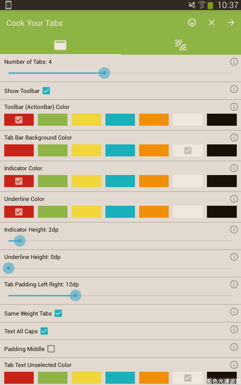
Github上有很多神人提供已經包好的MaterialTabs套件,經過一段考慮後,我決定使用pizza/MaterialTabs。 我選擇它有幾點原因:
- 支援Android API 9 以上所有版本
- 套件版本已經到2.0.2,代表基本上的issue都有解決了
- 提供超好用App直接Tab style客製化!
- 有material-ripple的水波效果!炫
教學在repo的README.md說明得很清楚,這裡指大致提一下。
1 ) 下載它的App-Material Tabs Demo後,開啟App會看到以下畫面,準備客製化自己的Tab外觀。
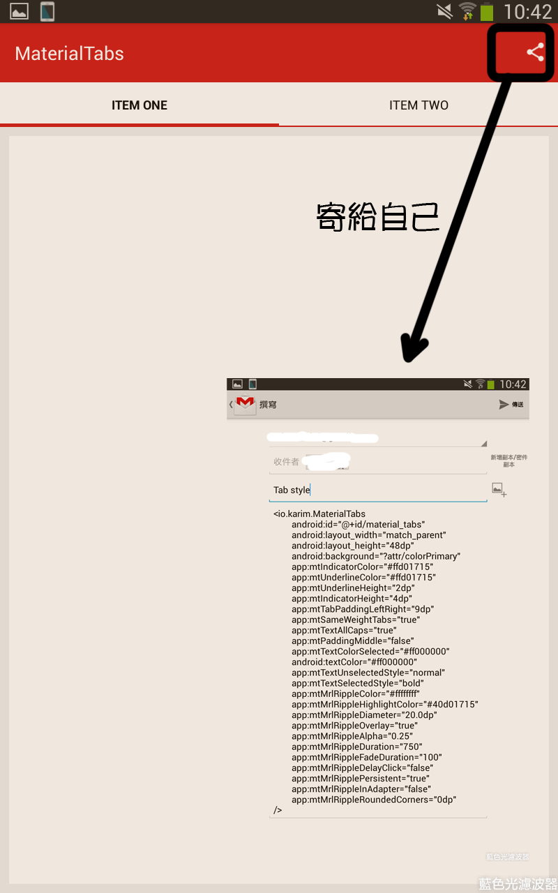
2 ) 在dependencies添加套件,把剛寄給自己的xml標籤添加到自己佈局的Toolbar和ViewPager之間,不用管TabLayout之類。
dependencies {
        compile 'io.karim:materialtabs:2.0.2'
    }
<include layout="@layout/mytoolbar_layout"/>
<!--Use App MaterialTabs to customize the tab's appearance-->
<io.karim.MaterialTabs
......
/>
<android.support.v4.view.ViewPager
android:id="@+id/viewpager"
android:layout_width="match_parent"
android:layout_height="match_parent" />3 ) 讓MaterialTabs與ViewPager相連,別忘自己實作Fragment和FragmentPageAdapter給ViewPager
MaterialTabs tabs = (MaterialTabs) findViewById(R.id.material_tabs);  // Use materialTabs
tabs.setViewPager(viewPager);
4 ) 超快的完成了!
5 ) 程式碼
git clone下面專案到自己的電腦後,使用 git checkout practice ,切換到branch practice。